SIGNAGE DESIGN • CHANNEL LETTERS • STOREFRONT MOCKUP
Channel Letter Storefront Sign
A custom illuminated storefront sign designed for a restaurant and saloon, combining bold typography, a distinctive western identity, and strong visibility for an exterior building application.
The Challenge
The project required a large exterior sign that would establish a strong western identity while remaining clear and recognizable from a distance. The design needed to balance the primary business name, supporting copy, decorative elements, and the technical requirements of an illuminated channel letter installation.
My Approach
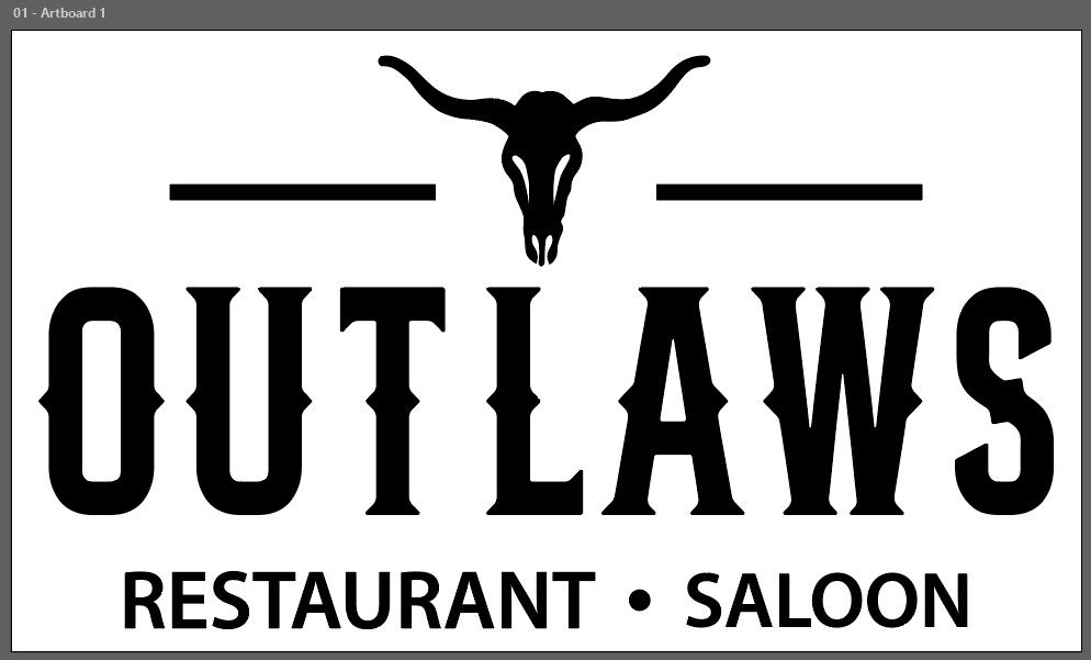
I developed a bold storefront composition centered around the Outlaws name, using strong typography and a longhorn symbol to reinforce the restaurant's character. The supporting text and horizontal accents were arranged to create hierarchy, balance, and visibility across the building facade.
Design Process
01
Build the Sign Layout
I organized the business name, longhorn mark, decorative lines, and supporting copy into a clear storefront composition with a strong central focus.
02
Refine Scale and Visibility
The artwork was adjusted to fit the available building space while maintaining readable proportions and a balanced presence across the exterior facade.
03
Create the Presentation Mockup
I produced a realistic storefront mockup to communicate the proposed scale, placement, illumination, and overall appearance of the finished sign.
The Result
The completed concept delivers a bold and recognizable storefront identity with strong nighttime visibility and clear visual hierarchy. The project demonstrates experience designing signage at architectural scale and presenting production concepts through realistic client-facing mockups.